Ahead of the start of 2020 international season, the home + away kits for US soccer’s campaigns have leaked. To be worn by the men’s team in the CONCACAF Nations league, and by both the women’s team and the U23 men’s team in olympic qualifying/hopefully the Olympics, these kits are ccllleeeeaaaaaaaannnnnnn.
Let’s take a look at each below:
HOME KIT:

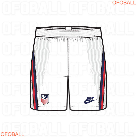
Featuring an all white look with the classic Nike futura logo, this home kit is best USA home kit since the 2014 iteration. After years of doing WWWAAAAYYYYY too much, Nike dialed it back here and gave us an absolute winner. Outside of the lightning bolt like graphic adorning the side of both the shirt and shorts (which is the template for all 2020 Nike international kits), a clean all white look with a straight forward navy crew collar really pushes this number into potential classic territory. I’m serious, this kit is THAT good. 9.1/10 on this one, hopefully Nike sticks to this clean formula for the 2022 WC kit AKA our golden generations coming out party (for the men’s team anyways).
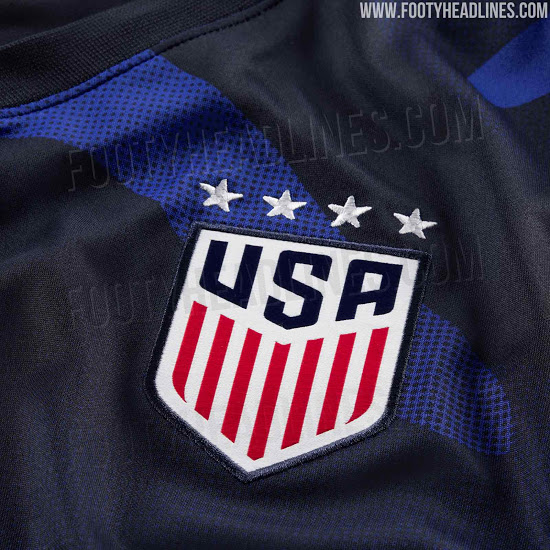
AWAY:
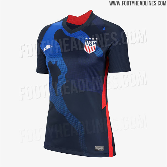
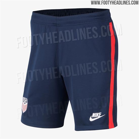
Remember when I said Nike tends to do way too much? This 2020 away kit Is exactly that. Rather than sticking to the clean design formula found on the home, the swoosh decided to slap an ill advised camo pattern on these kits that looks far more like a bleach stain than any sort of stealth motif. Why not just flip the home shirt colors and make a navy away with a white collar?? Shit would’ve been GORGEOUS, but instead we get this god awful away smfh. 2.2/10, though I do have to say the badge looks lovely with those 4 women’s WC stars.
GOALKEEPER:
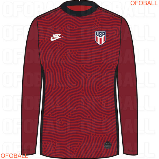
I got 2 things to say about keeper kits:
- They should be AS WILD AS POSSIBLE, this is where you use wild neons and crazy patterns, kit should be a distraction to all players attempting to score.
- nobody really ever buys keeper kits anyway, which is a shame because they are usually DRIPPIN.
given the above, I’m sure Zack Steffen will look great slapping lasers from Carlos Vela into the upper deck in this, the pattern while loud is tonal and subtle, but just enough to distract the opposition. 6.7/10.
look for these to officially be unveiled and go on sale in March, a Tim Weah version of that home could very much be in the cards for this writer.
